Visual interface design for a business metrics dashboard
This project involved designing a responsive analytics dashboard for a B2B SaaS product. The goal was to present large volumes of data in a way that felt digestible and meaningful — not just functional, but visually appealing and intuitive.
I began by mapping out the hierarchy of information: what users needed to see first, what could sit in the background, and how filters or comparisons would be used in practice. Working closely with the client’s developer, I created wireframes to test different layout structures before moving into full design.
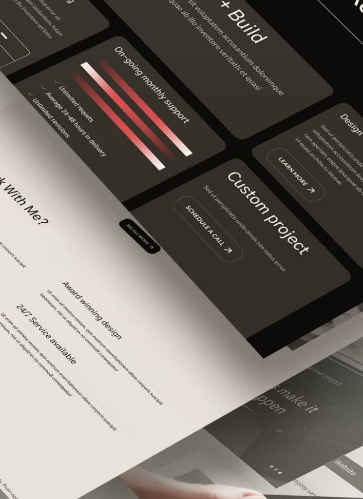
The final interface uses a deep grey background with colour-coded data cards, crisp typography, and interactive charts that highlight changes over time. I also incorporated a collapsible sidebar, light/dark mode options, and contextual tooltips to help users understand complex metrics at a glance.
This dashboard turns dry data into something people actually want to interact with — and makes key insights easier to spot in less time.